Problem
Every generic travel brand was already telling Gen Z to "explore the world." FirstTrip needed a visual language that made them feel understood first, sold to second.
The online travel market for young adults is one of the most cluttered categories in consumer tech. Booking platforms, airline apps, itinerary tools, they all promise adventure, freedom, and discovery. Most of them look nearly identical: dark blues, clean sans-serifs, stock photography of strangers laughing on beaches. The product differentiation is real. The visual differentiation is almost non-existent.
FirstTrip's positioned itself as a community-first travel platform built specifically for Gen Y and Gen Z, which was genuinely distinct. The challenge was making that distinction visible before a user read a single word of copy.
Who: Gen Y and Gen Z travelers who are deeply skeptical of brands performing youth culture rather than genuinely speaking it
What: A brand identity that needed to feel like it came from the audience, not for them — across logo, type, color, pattern, photography, and every application
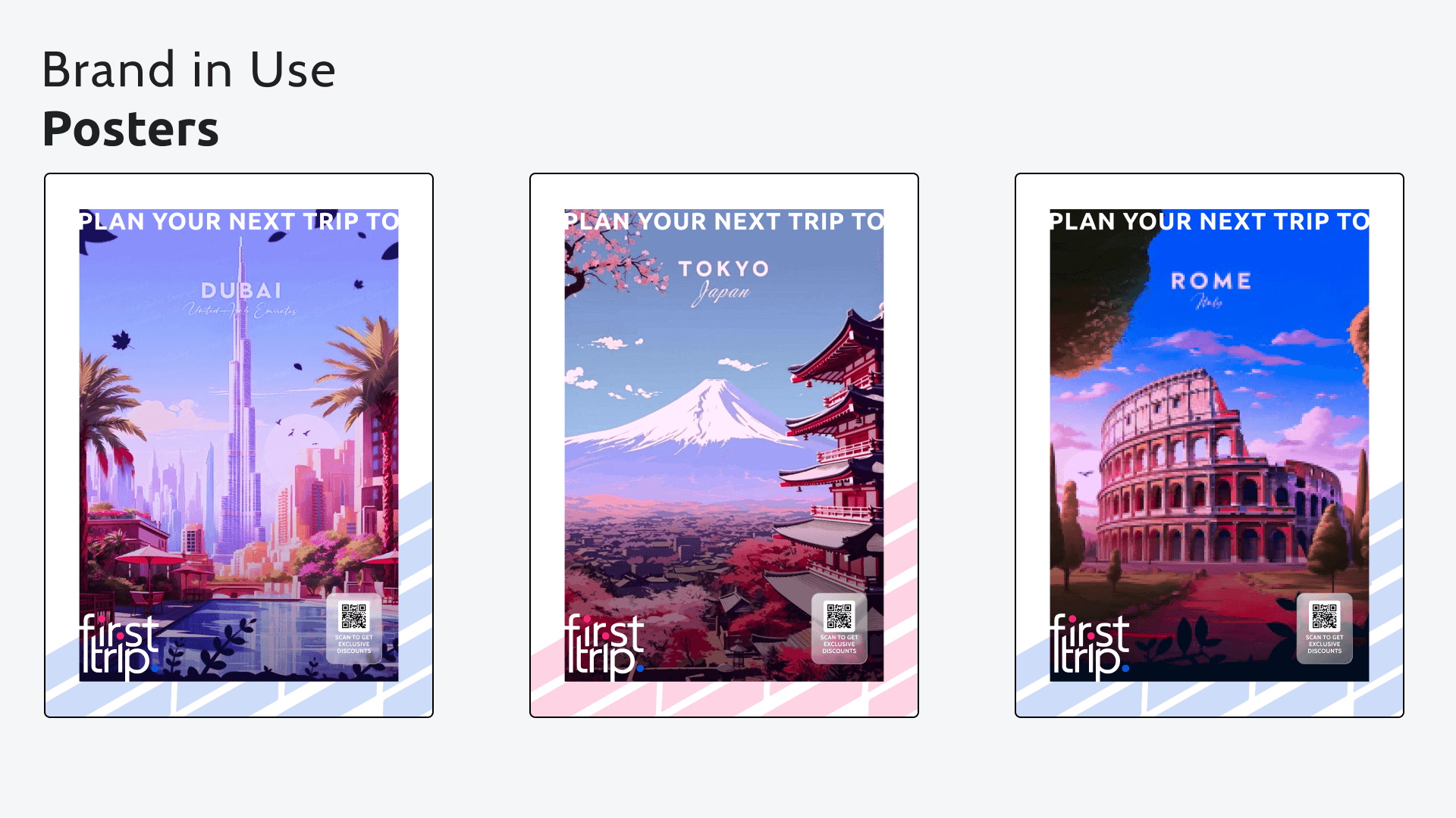
Where: Every touchpoint — website, social, posters, stationery, clothing — had to tell the same story without a single inconsistent note
When: At first glance, in a scroll, in a thumbnail — the brand had microseconds to signal the right things
Why: A brand that looks like every other travel app loses on visual equity before the product even has a chance to compete
The business stakes ran deeper than aesthetics. A misaligned brand doesn't just look wrong, it actively undermines trust with an audience that has seen enough performative design to spot it immediately. FirstTrip had to earn visual credibility before earning a booking.

Thinking
Competitor research mapped the visual language of 15+ travel brands and overlaid it with the design aesthetics of digital products Gen Y and Gen Z actually use, from fintech apps, music platforms to social-first brands. The gap was clear: nobody in the travel category was speaking this visual language. It was wide open.
Strategic considerations
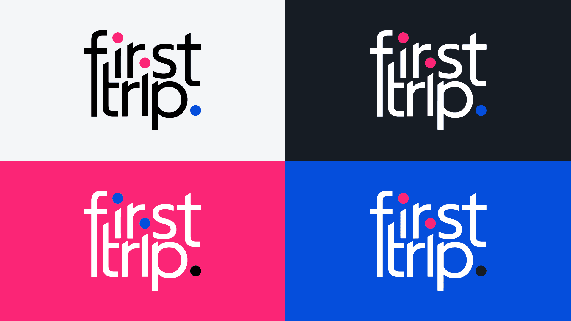
The core tension: FirstTrip needed to feel bold enough to turn heads in a social feed, and trustworthy enough to hand over payment details. Too playful and it looks like a startup that might not deliver. Too polished/corporate and it becomes invisible to the target audience. The pink and blue palette carries this tension by design: pink for energy, passion, and personality; blue for trust, stability, and reliability. Neither dominates. Every application decision dictates how much pink, how much blue, when to go dark and when to go light.


Solution
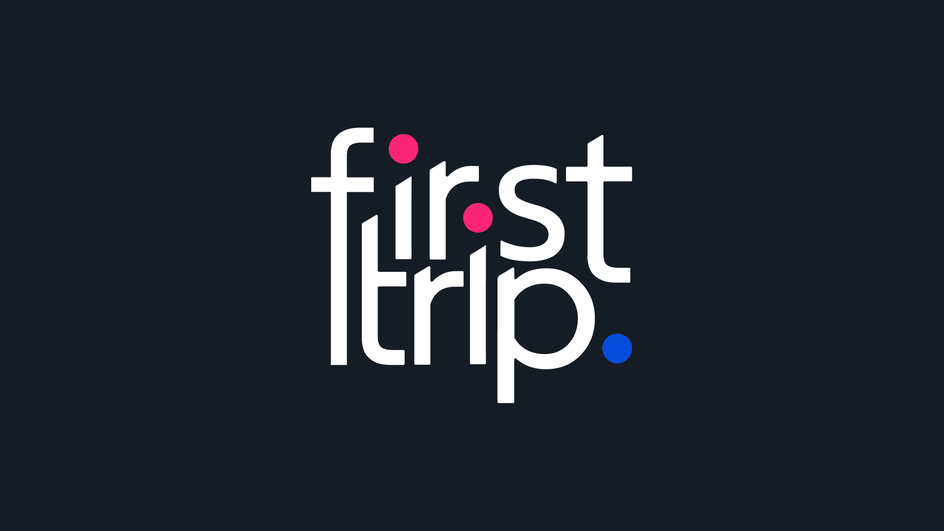
The final FirstTrip brand system is built around a single radical decision: the logo and the brand palette are the same thing. The trademark dot system with vibrant pink and blue dots replaced letterform counters inside the wordmark. It means the identity mark IS the color story. Everything else extends from there.
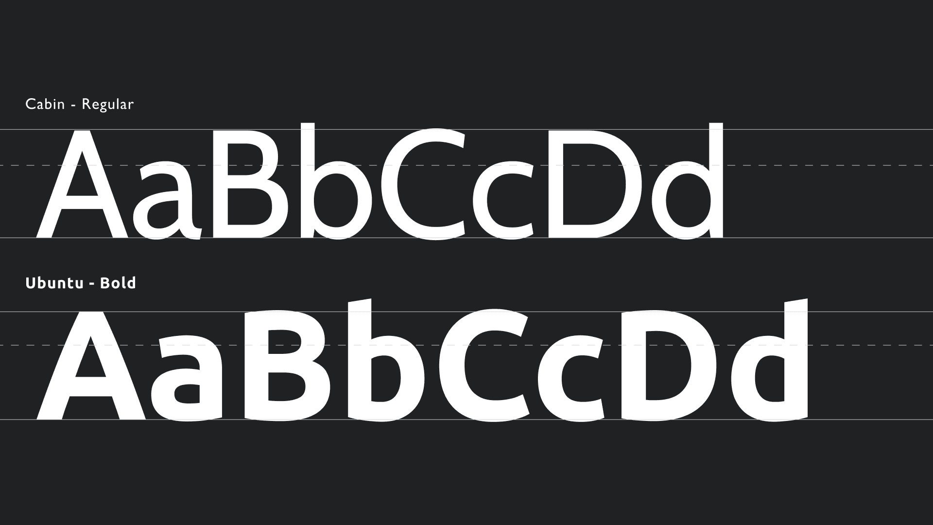
At the typographic foundation: Ubuntu Bold handles all display work with its rounded, slightly quirky geometry sits perfectly between modern and approachable without tipping into either extreme. Cabin Regular carries the body, social captions, and CTA text. The two fonts share a similar x-height and stroke weight, making the hierarchy feel deliberate rather than assembled.
The photography rule is the brand's most powerful scalability decision. Rather than prescribing shot type, composition, or subject matter, the guidelines mandate a single rule: every image must be colour-graded exclusively into the pink or blue range. This means any destination photograph, from Tokyo street markets to Greek coastlines; becomes unmistakably FirstTrip through processing alone. The system doesn't constrain what gets photographed. It controls how any photograph is received.
The two brand patterns solve the same problem at a graphic level: the circular-and-diagonal motif signals motion and speed; the diagonal-stripe pattern (mirroring the angle of the logo's letterforms) creates continuity. Together they give the brand texture across surfaces, packaging, slide backgrounds, social templates; without requiring custom illustration every time.