Problem
Bangladesh's games had survived for centuries, but they'd never had a brand bold enough to make the world sit up and play.
The Indian subcontinent is one of the richest game-design cultures on earth. Ludo, Carrom, Bagh-Bandi, Chhor-Guti ; these aren't just pastimes, they're living history. Yet on shelves and screens, they were invisible. The global board game market was dominated by companies that could afford loud, polished branding. Local games got treated as folk artifacts, not products worth celebrating.
The 5 Ws shaped everything:
Who: Bangladeshi players proud of their heritage, plus an international audience hungry for something genuinely different
What: No single brand compiling, championing, or modernizing the games originating in Bangladesh
Where: A competitive market full of global gaming giants with established visual equity
When: Exactly the moment when "local culture" was becoming a global selling point, not a limitation
Why: Without a strong brand, the richness of these games would keep being overlooked as "niche" rather than celebrated as distinct
The business stakes were clear: in a crowded category, invisibility is fatal. Khelo didn't just need to be good; it needed to own a visual and cultural territory that no competitor could copy, because no competitor shared its roots.


Thinking
The first direction played it safe. Earthy tones, traditional motifs, museum-quality illustration: a brand that looked like a cultural preservation project rather than a game company. It was respectful. It was also completely forgettable.
Successful failure
The "heritage palette" direction, warm ochres, aged paper textures, calligraphy-style type felt right in theory. In practice, it triggered the wrong associations: museum, artifact, past. Game players don't want to visit history. They want to play it. That failure forced a complete tonal reset toward something louder, more alive, and unapologetically present-tense.
A competitor audit across South Asian game brands, international indie game publishers, and toy companies revealed a consistent pattern: the brands that broke through weren't the most "authentic" by traditional standards, they were the ones that translated cultural energy into contemporary design language. Research methods that shifted the direction:
Visual competitive audit: Mapping 20+ game brands on a "nostalgic ↔ contemporary" axis revealed a wide-open space in bold, modern Bangladeshi identity — nobody was there
Cultural reference excavation: Deep-diving into the visual language of the games themselves — game boards, playing pieces, folk art — surfaced recurring shapes, color logic, and character archetypes that could be abstracted into a brand system
Typography stress-testing: Testing typefaces at packaging scale, social thumbnail size, and merch scale eliminated anything too restrained to hold character at small sizes
Strategic considerations
Khelo had to honor the source material without becoming a nostalgia trap. Too reverent would be appealing only to people who already knew the games, invisible internationally. Too modern, and it would be losing the cultural specificity that made it worth caring about. Every decision, from the brightness of the palette to the expressiveness of the characters, the choice of a "funky" rather than formal typeface was made to hold both ends of that tension simultaneously


Solution
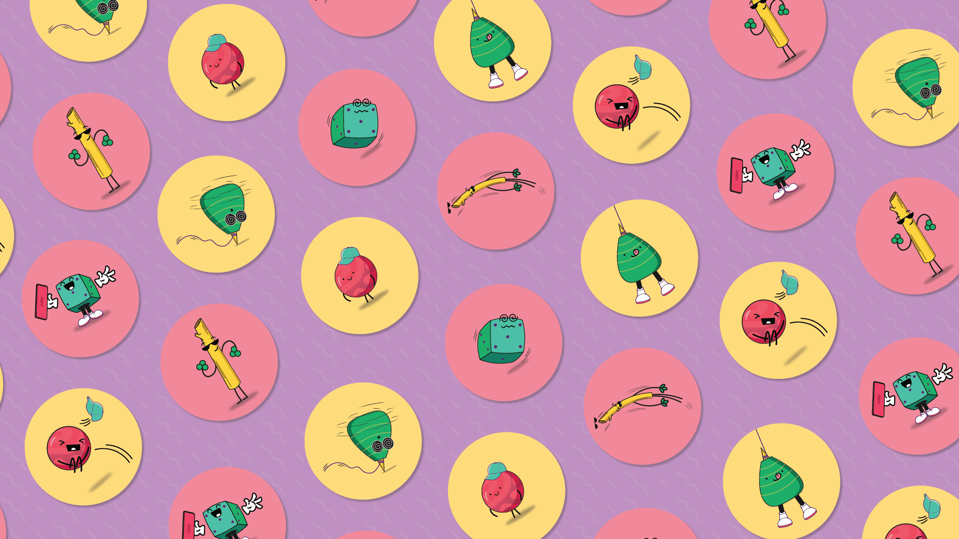
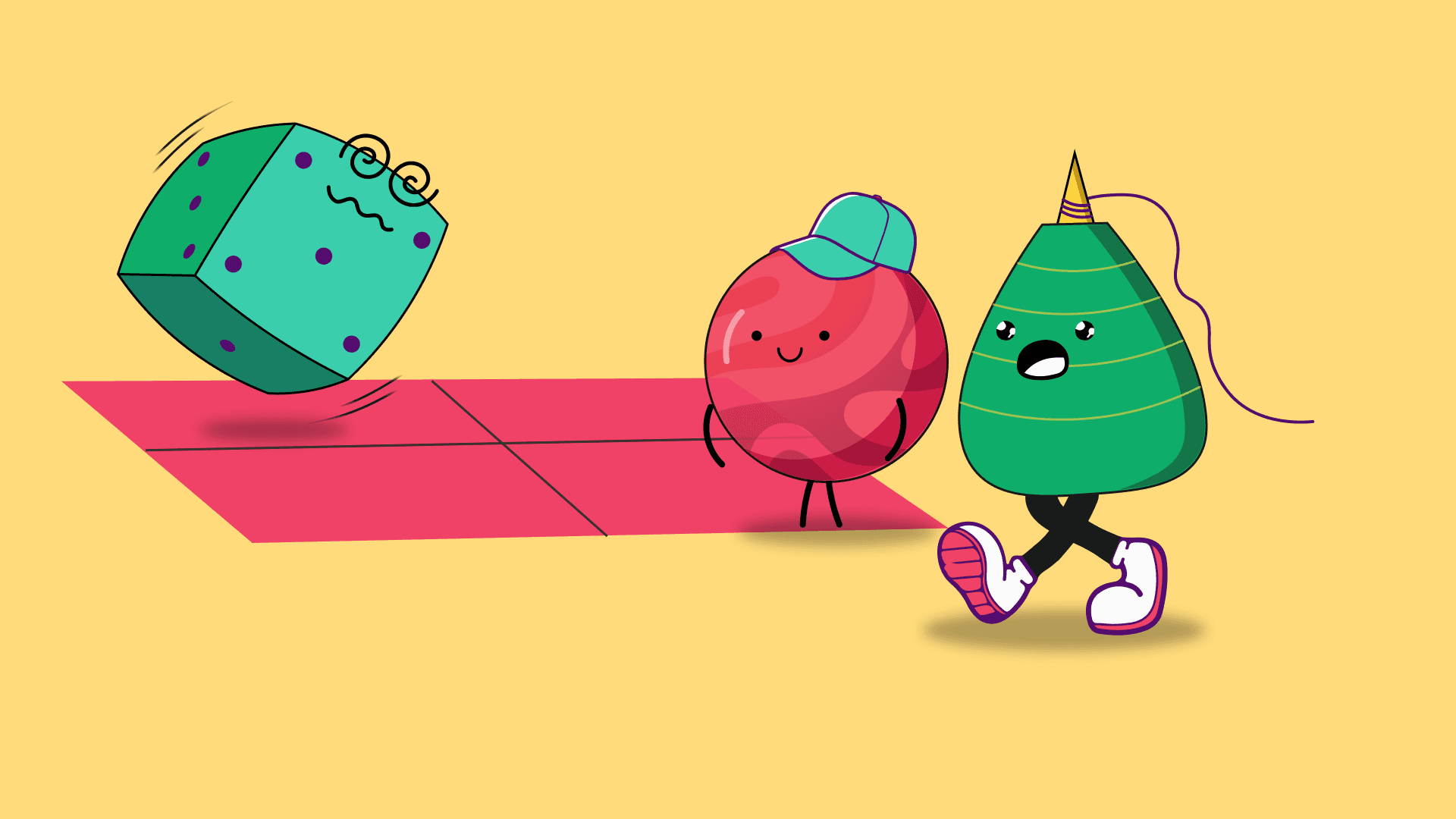
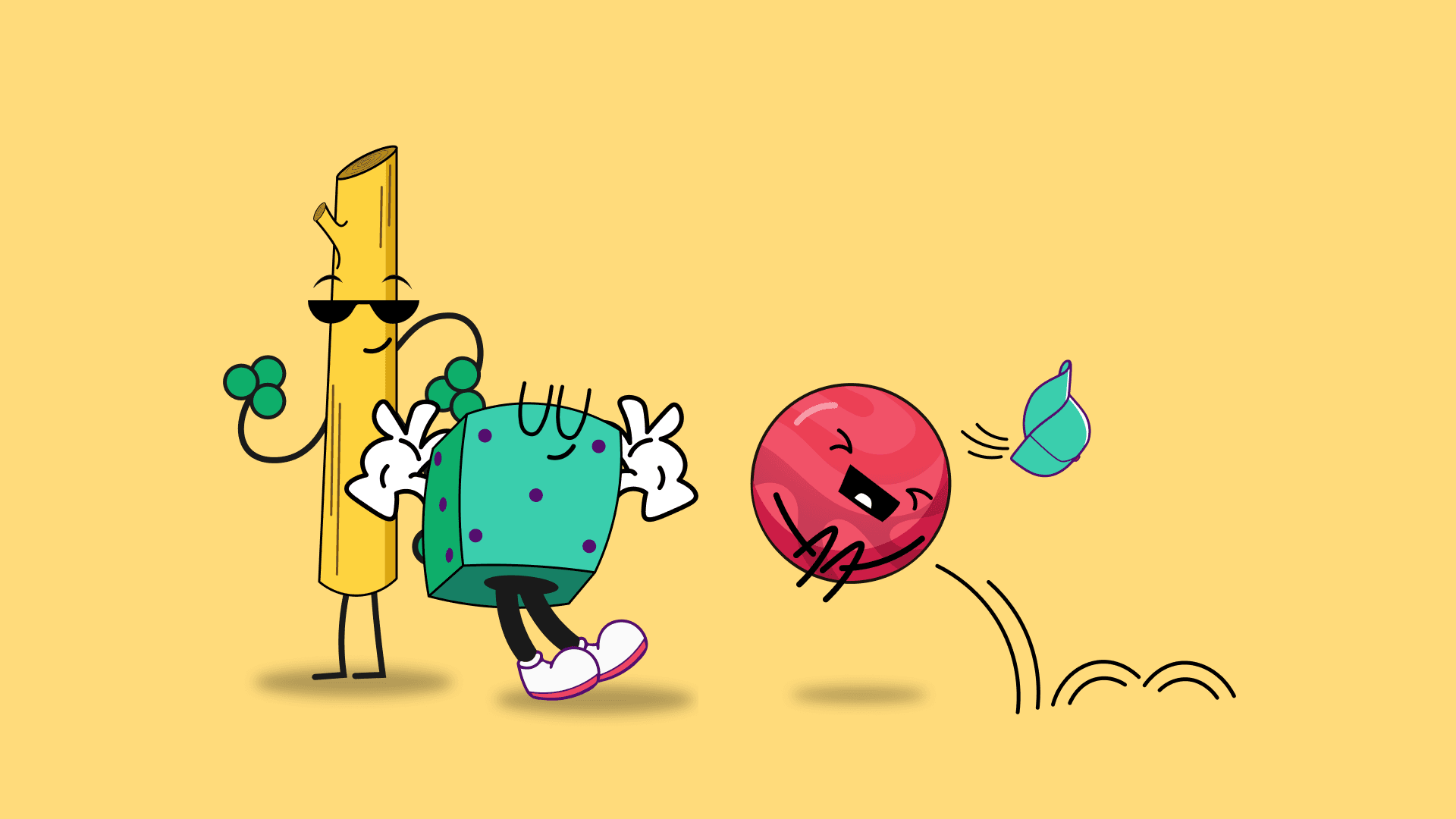
The final brand system for Khelo is best described as: classic game equipments turned up to full volume. It feels like it came from somewhere specific and wants to take you there. A character-driven identity, figures drawn directly from the games' own iconography; anchors every touchpoint and gives Khelo something most competitors can't buy: a cast.
Topic | How it is covered |
|---|---|
Mark | Logo with character-integrated system |
Cast | Game-inspired character design |
Energy | High-saturation color tokens |
Voice | Expressive display typography |
World | Patterns & graphic elements |
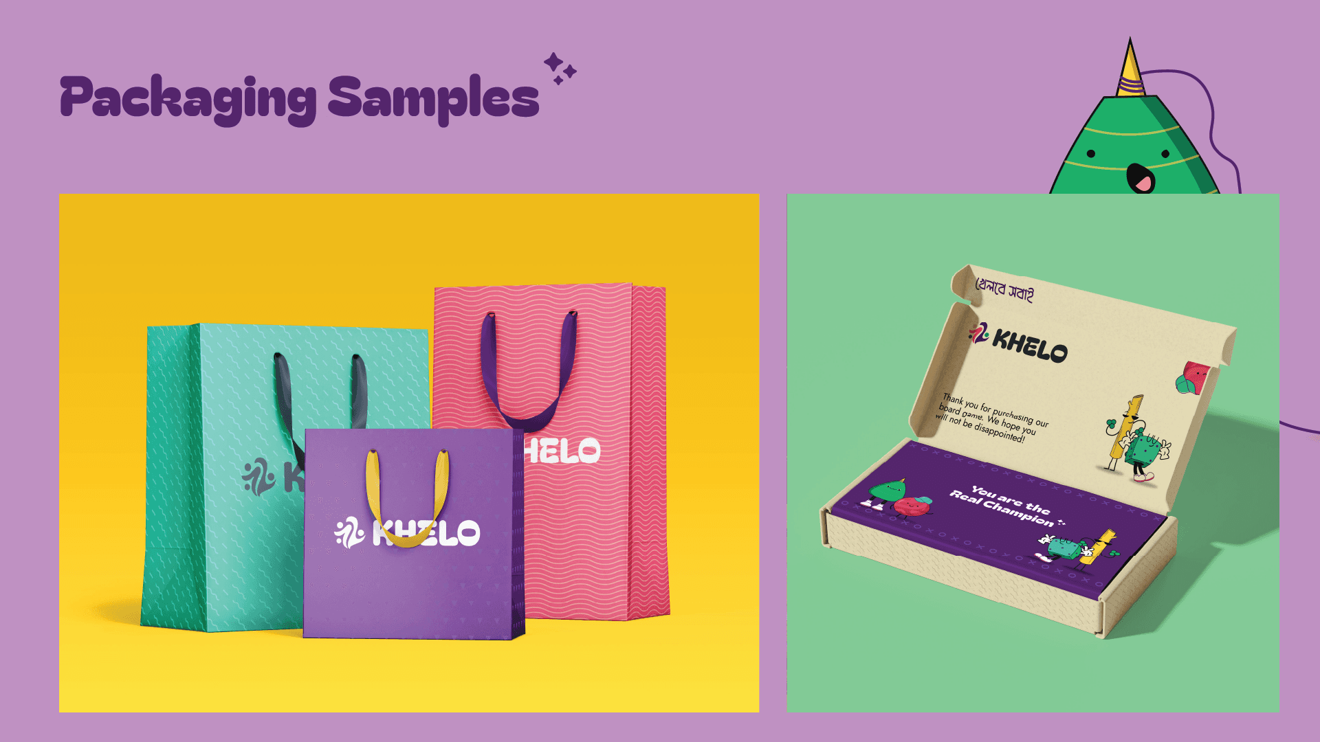
Reach | Packaging & digital applications |
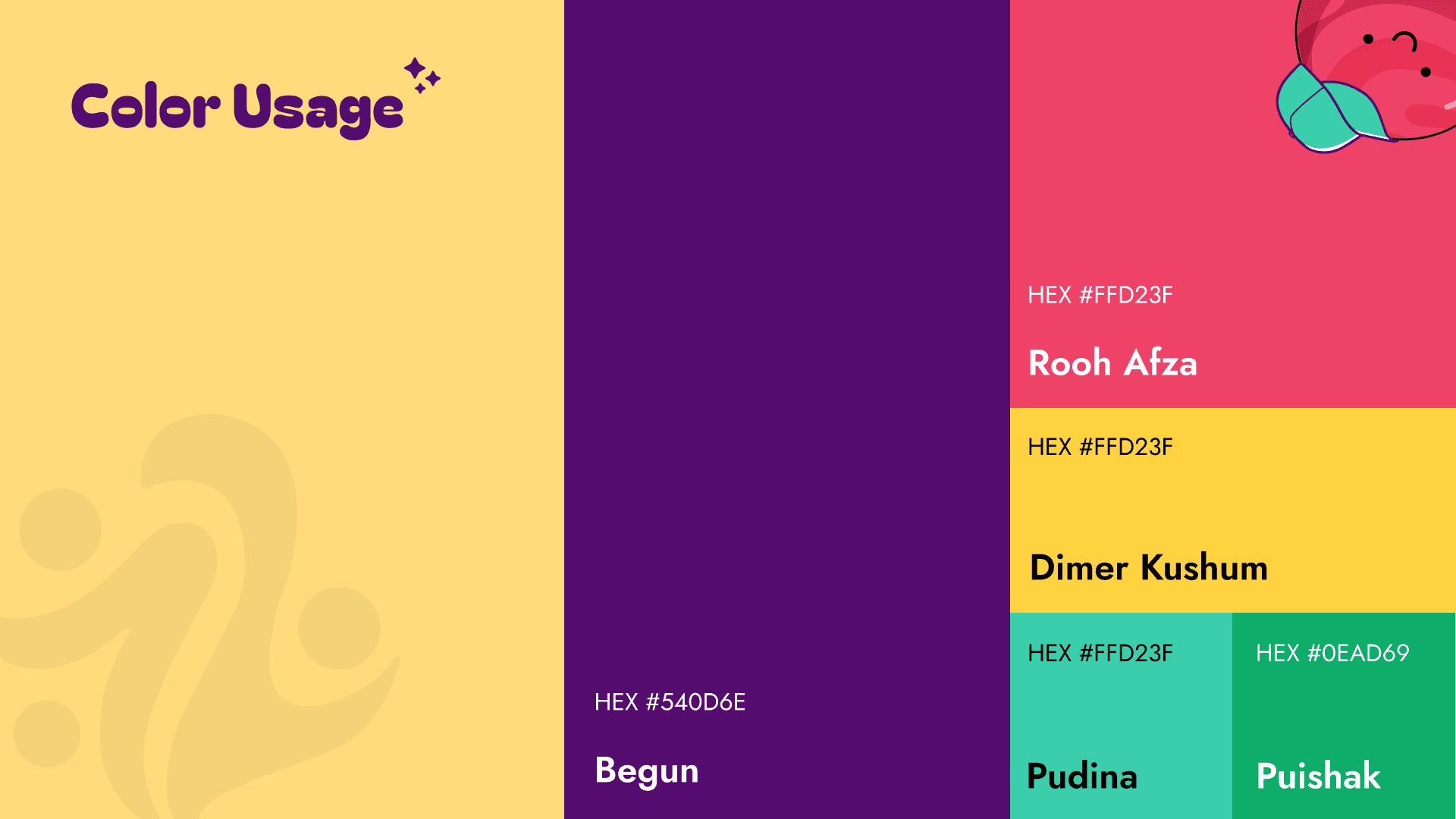
At the foundation: a color system built around brightness, not subtlety. Each hue maps to a specific cultural reference: the colors of Bagh-Bandi boards, festival banners, hand-painted playing pieces; then pushed to the saturated edge of that reference rather than pulled back toward "tasteful." The result is a palette that reads as distinctly Bangladeshi even to someone who's never seen the source material.
The character system is where the brand scales. Each game gets a character. Each character is a consistent design language, proportions, line weight, expression style that can extend to new games without starting from scratch. Add a new game to the Khelo library, and the brand can produce its character using the same rules. That's the infrastructure play: a system that grows with the catalog.
Typography did the final work: a display typeface with enough personality to hold its own against the characters and color, without competing with them. The type says "we're serious about this" and "we're having fun" at the same time.
The clearest signal of success: the brand works at every scale, from a playing-piece detail to a full campaign poster; without losing its identity. It looks like Bangladesh. It looks like right now. And it looks like nothing else on the shelf.